

From Pantone Reference to Production: A Buyer’s Guide to Custom Drinkware Color Approval
A brand color can be instantly recognizable on a website and surprisingly difficult to approve on a physical bottle. The same teal may look deeper on a matte powder coat, brighter on a glossy component, and different again when viewed on a phone screen.
That does not make color control subjective. It means the approval process needs more information than a color number alone. For retail brands, promotional product companies, and procurement teams, a structured custom drinkware color matching brief can reduce avoidable revisions and give the manufacturer a clearer production target.
Treat the Pantone Reference as the Starting Point
A Pantone reference gives designers, buyers, and manufacturers a shared color language. It is far more precise than asking for “navy,” “sage,” or “the blue in our logo.” However, the reference should be identified completely, including the color system and any suffix shown in the approved brand standard.
Pantone itself notes that on-screen simulations may not match its physical standards. Screens emit light, devices render color differently, and brightness settings can change what reviewers see. For a physical product, the current physical reference or approved material sample should carry more weight than a screenshot, presentation slide, or emailed image.
Define the Surface Before Approving the Color
Color is always seen on something. A reference printed on paper will not behave exactly like a coating applied to stainless steel or a color molded into a plastic lid. Gloss level, texture, metallic effects, curvature, and the base material can all change the perceived result.
The initial brief should connect the color target to the intended construction. Specify the bottle model, body material, surface finish, lid and handle colors, logo method, and any packaging elements that must coordinate with the product. If one range contains several materials or finishes, treat each application as a separate approval point instead of assuming one reference will look identical everywhere.
Review a Physical Sample in Context
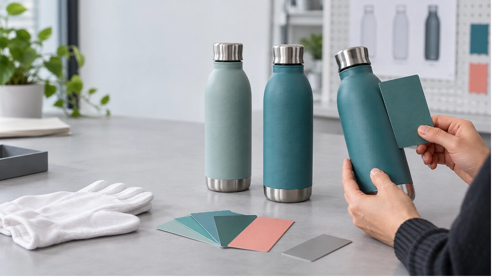
A color sample should be reviewed as the customer will see it: on the selected bottle, with the intended finish, components, and branding. A flat color chip remains useful as the target, but a curved bottle surface reflects light differently and can make a color appear lighter or darker across the body.
Use consistent viewing conditions for internal reviews. Compare the sample with the agreed physical reference under neutral, repeatable lighting, then check it in the environments that matter commercially, such as a retail shelf, office, or daylight near a window. Record the viewing conditions so different reviewers are not making decisions under unrelated light sources.
Approve the Complete Color System
Many drinkware projects combine a coated metal body with plastic, silicone, printed, or packaged elements. Even when every component is described with the same color name, differences in material and finish may remain visible.
Review the bottle body, lid, handle, gasket visibility, logo contrast, and packaging together. Decide whether the goal is a close visual match, an intentional tonal family, or a contrasting system. This is especially important for retail collections in which several capacities and lid types need to look related without being physically identical.
Turn Approval Into a Production Reference
“Color approved” is too vague for a production record. Connect the decision to a dated specification, the exact product and finish, approved artwork, clear sample photographs, and the retained physical sample used for review. Identify who has authority to approve changes and how later revisions will be recorded.
If your organization requires an instrumental color tolerance or a specific inspection method, agree on the measurement conditions, equipment, locations, and acceptance criteria before production. A numerical limit should not be copied from another project without confirming that it is appropriate for the material, finish, and commercial expectation.
Plan for Repeat Orders and Multiple SKUs
Color management continues after the first order. Keep the approved specification and retained reference available for repeat production, and identify any change in supplier, material, coating, process, or component that should trigger a new review.
For a collection, maintain a simple color matrix listing each SKU, component, material, finish, reference, approval status, and sample date. This helps purchasing, design, and quality teams work from the same information and prevents one approved bottle body from being treated as blanket approval for every variation.
A Decision-Ready Color Brief
Before requesting a color sample, provide:
The complete Pantone reference or other approved physical standard
Bottle model, body material, and surface finish
Color requirements for the lid, handle, gasket, logo, and packaging
Artwork files and the intended branding method
Estimated quantity by SKU and destination market
Target dates for sampling, approval, production, and arrival
Required viewing, measurement, documentation, or inspection criteria
The name of the final internal approver
Move From Color Intent to an Approved Product
Good color control does not depend on a single perfect email attachment. It comes from a shared reference, the correct material and finish, a physical sample, and a record that tells every team what was approved.
WaterBottleX offers custom color matching and finish options for custom drinkware projects. Share your selected bottle, physical color reference, finish, components, artwork, quantity, destination, and approval requirements to discuss a suitable sampling path: https://waterbottlex.com/customization/